Netech: a new UX for anti-money-laundering calibration in banks
A UX and UI redesign for a platform behind anti-money-laundering controls in banks: solid backend, an interface that is finally clear.

- Year
- 2023
The problem
NordEst Technology sells information security to banks and the public sector, the two fields where regulation and technology are most tightly entwined. Among its tools is a calibration platform: the one used inside banks to set and verify the parameters that anti-money-laundering controls rest on. It is not a dashboard glanced at once a month, it is an operational tool somebody opens every day to work inside.
It worked, and that has to be said before anything else. It did have two limitations, of different kinds. The first was about flow: the operations repeated most often asked for more steps than they needed, and the friction accumulated across a working day. The second was technical: the front-end stack was not sized for the performance that views this dense with data require.
How we solved it
We began with an assessment of the existing software, carried out with the client, to find its strengths before its weaknesses. The stated aim was not to rewrite for the sake of rewriting: it was to work out which steps in the experience were genuinely obstructing the operator. We mapped the existing flows in Miro, reconstructing the real journeys rather than the ones in the manual, and from there came the proposals for improvement, in both graphics and sequence, taken to the client and validated before touching any code.
The engine was not the problem. The problem was asking the operator to remember what they had already calibrated.
The heart of the work is the domain and discovery platform: the environment where the country domains requiring calibration are registered, the parameters entered and the checks to be applied to different entities defined for anti-money-laundering verification. It is a domain with many dimensions, and the difficulty for whoever uses it is never the individual value: it is holding the relationship between country, entity, parameter and control in mind while working.
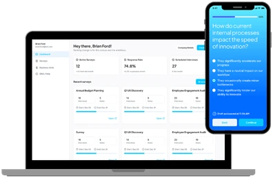
That is where the UX went to work. We reorganised the sequence of operations and made explicit in the interface what used to live in the head of whoever was working: what has already been calibrated and what is still to be checked. Information the system already had but did not show, and which a person had to reconstruct for themselves every time they picked a session back up.
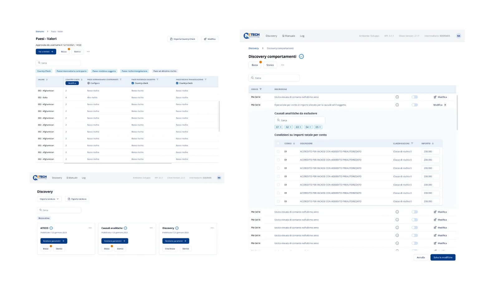
On the technical side the front end was rebuilt in Next.js with TypeScript. Performance on dense views is half the reason; the other half is strong typing, because here parameters, entities and checks have intricate structures and a modelling error does not show up in development, it is paid for at control time. Tailwind keeps the visual language consistent and close to what was validated in Figma, Redux Toolkit keeps calibration information consistent across views through long working sessions, and deployment sits on Vercel with the pipeline aligned to the release cycle.
The results
What we delivered does exactly the same things as before. That sounds like a disappointing sentence and it is in fact the point: on a compliance tool, changing what the software does means reopening controls somebody has already validated. What changed is the cost of running it, on a platform that will be easier to maintain for years.
Design carried out in Miro and Figma used as shared working tools rather than delivery formats: Miro to map the existing flows and reconstruct the real user journeys during the assessment, Figma for the clickable prototypes on which the client validated the proposals before a single line of code. A Next.js front end in TypeScript, chosen for performance on data-dense views and for strong typing: in a domain where parameters, entities and checks have intricate structures, a modelling error is paid for at control time. Tailwind for a consistent, reusable visual language built from what was validated in Figma, keeping the distance between design and implementation short. Application state in Redux Toolkit, because calibration information is shared across different views and has to stay consistent through long working sessions. The web app is deployed on Vercel, with the pipeline aligned to the front-end release cycle.
Design carried out in Miro and Figma used as shared working tools rather than delivery formats: Miro to map the existing flows and reconstruct the real user journeys during the assessment, Figma for the clickable prototypes on which the client validated the proposals before a single line of code. A Next.js front end in TypeScript, chosen for performance on data-dense views and for strong typing: in a domain where parameters, entities and checks have intricate structures, a modelling error is paid for at control time. Tailwind for a consistent, reusable visual language built from what was validated in Figma, keeping the distance between design and implementation short. Application state in Redux Toolkit, because calibration information is shared across different views and has to stay consistent through long working sessions. The web app is deployed on Vercel, with the pipeline aligned to the front-end release cycle.
- Year
- 2023
Got something similar in mind?
Tell us what you want to build and we will help you find the shortest way there.